
I actually want to live in the beating heart of the city, and not flee into the dull suburbs like so many do. But the city really does have crime issues, and no one wants to raise their kid in a neighborhood where drive by shootings occur. Somewhere between the multimillion dollar homes on the lakes and the crime centers, there must be some places, right? But where…
Being a data drive person by nature, I of course turned to looking at crime data. And was greatly disappointed. Most crime maps are either just loose points of recent crime, difficult to interpret, or chunky, unrefined neighborhood maps that condemn most of the city all at once. They don’t properly show where the crime occurs over time. And per capita maps, too common, often have weird errors in commercial districts.
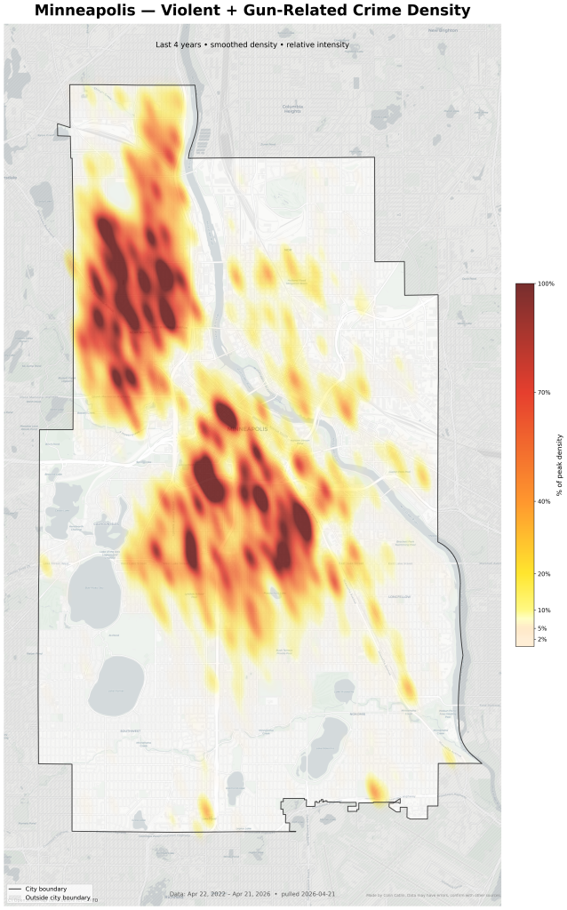
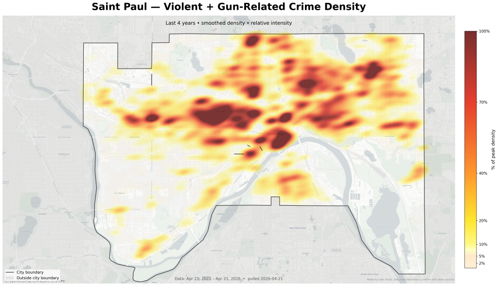
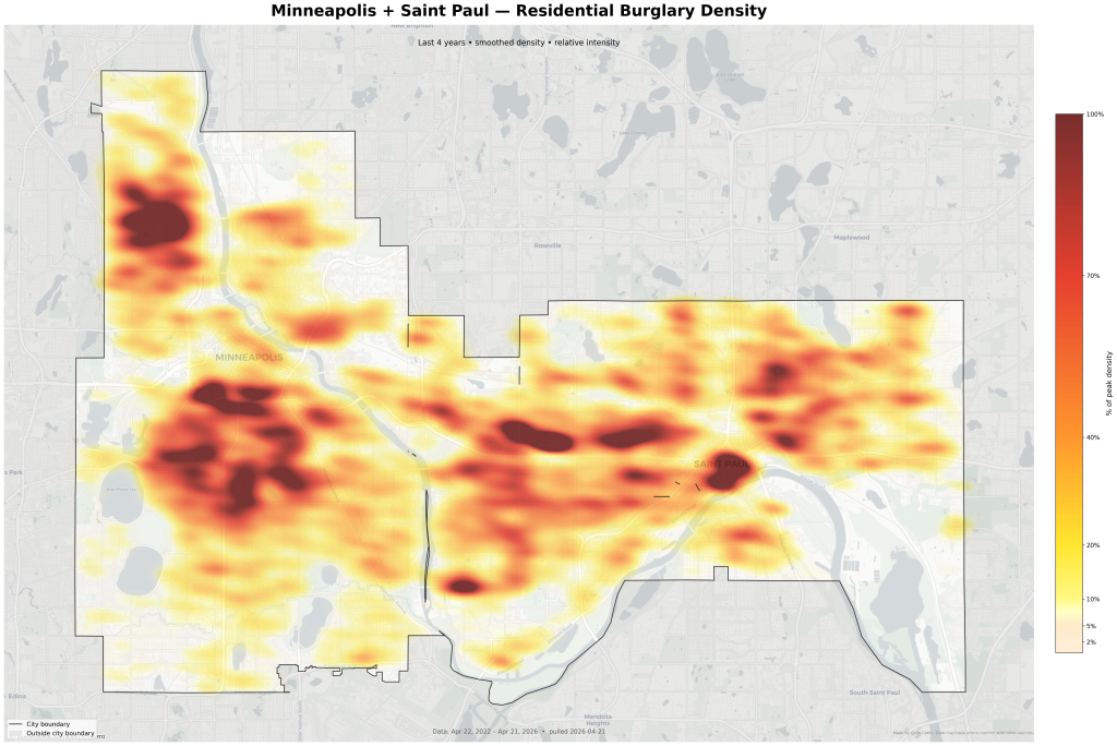
It is also rather important to separate the type of crime. Burglary is not something one wants, but it is generally something one can better prepare for and live with if it happens more rarely, while violent crimes are a great concern (although they do happen even in the calmest suburbs). How far does crime matter? My reading suggests crime impacts a neighborhood most within 400 meters or so, a smaller area than many might guess, so that is how we will define the ‘width’ of a crime (I rather suspect this perception varies by surburb vs city, 4 blocks away in a city can be quite a lot, especially if across a freeway or train track, while in the suburbs that can be the same street and be close neighbors).
AI quite helped to make these maps, they figured out the API much faster than I would have in the past. But there were some mistakes. In the first pass at St Paul data the code “geocoded” the data by randomly scattering data around each district, which looked realistic enough but turned out to be false precision when I dug into it. It got it sorted in the end, however. Another issue were the data categories. I wanted to be able to plot Minneapolis and St Paul side by side, however St Paul violent crime data always fell a lot below Minneapolis, not because it had less crime but because something (one of their labels they use, presumably) was missing or misunderstood. Burglaries aligned but not violent crime. Instead of sorting that out, I just plotted that separately for both cities. Both cities clearly have data errors, failed geocodes are one known issue for both (so a crime occurred but the published reference is too vague to link to a latitude and longitude) which may skew data.
Minneapolis suburbs do not publish their data as nicely as the cities proper do (and kudos to Minneapolis and St Paul for making excellent data easily available online). Many publish to https://communitycrimemap.com/ but that is not a good representation (for example, St Paul crime seems to be only published there if the Ramsey County Police dealt with it, but not if the city police did, that is this other dataset). Suburbs to be aware of right now are Brooklyn Park/Brooklyn Center, and a few parts of South and West St Pauls (which are separate cities technically).
Trying to decide how to color the scale of crime was hard. It is quite tricky to decide what level of crime is “no crime” and what is “too much crime”. Here the colors are based on the 99th percentile of the maximum crime density (percent of maximum works well for Minneapolis where we have some “bad” neighborhoods that set the scale well, but are not complete insane outliers either, but if this was run just on low crime suburb data this would make even safe areas look artificially dangerous). From there, my research suggested 2% of peak crime is “quiet suburb” crime cap, then the 5% – 10% of max is “some risk but generally one more people would be comfortable with”. This map now seems to match my expectations more-or-less as far as my own understanding of the ‘bad’ neighborhoods is. The TLDR here is that the data isn’t perfect, and the graph isn’t perfect, so don’t use this as your sole judge of a place’s character.
Code for this is published nested in some in-development house design code: https://github.com/winedarksea/catlin-house/blob/39aad537355d1d4d75915bead00da838cc7327de/references/msp_crime_density_map.py
It is very important to remember that comfort depends on “disorder cues, lighting, vacancy, and familiarity” as much if not more than the actual crime level, so just because an area looks good on a map doesn’t mean your significant other will find that it “feels safe” (or vice versa).
Some follow up data summaries:
[Minneapolis] canonical alignment audit
total incidents (4y): 209,991
violent matched: 46,712
gun matched: 37,394
home burglary matched: 12,081
mapped to at least one target category: 90,403 (43.1%)
Top unmapped offense labels:
– DESTRUCTION/DAMAGE/VANDALISM OF PROPERTY: 25,962
– MOTOR VEHICLE THEFT: 25,876
– ALL OTHER LARCENY: 23,460
– THEFT FROM MOTOR VEHICLE: 15,942
– THEFT OF MOTOR VEHICLE PARTS OR ACCESSORIES: 5,922
– DRUG/NARCOTIC VIOLATIONS: 3,805
[Saint Paul] canonical alignment audit
total incidents (4y): 160,656
violent matched: 7,693
gun matched: 4,353
home burglary matched: 6,069
mapped to at least one target category: 17,512 (10.9%)
Top unmapped offense labels
– PROACTIVE POLICE VISIT: 79,631
– THEFT: 32,983
– CRIMINAL DAMAGE: 11,586
– AUTO THEFT: 9,343
– NARCOTICS: 7,216
– COMMUNITY EVENT: 2,382
Colin Catlin, 2026